Dashboards in Excel
Data Development - Rancho Cordova, Ca
Dynamic Dashboards in Excel
Dynamic Dashboards has become a real key interest over the past few years when talking about Microsoft Excel. Being able to build dynamic dashboards shows a skillset that utilizes a lot of things someone would need to have in Excel to make this even possible. Dynamic dashboards are interactive reporting tools that enables users to analyze, monitor, and visualize data in real time. Unlike static reports, which remain fixed and require manual updates, dynamic dashboards adapt to changes in the data or user input. They are designed to empower decision-makers by providing actionable insights quickly and efficiently.
One thing that can make dynamic dashboards powerful is real time or automated updates. Dynamic dashboards can automatically update when data is added, modified, or refreshed. This can be achieved through dynamic ranges, Power Query and external connections. So, for instance a sales dashboard would update automatically as new transactions are entered into a database.
A few of the core features in a dynamic dashboard is interactivity. Users can adjust filters, slicers, and dropdowns to drill down into specific data views or analyze subsets of data. Some of the key tools that can be used are slicers and timelines and form controls. So, for instance a marketing campaign dashboard where the user selects a region to view performance metrics for that area.
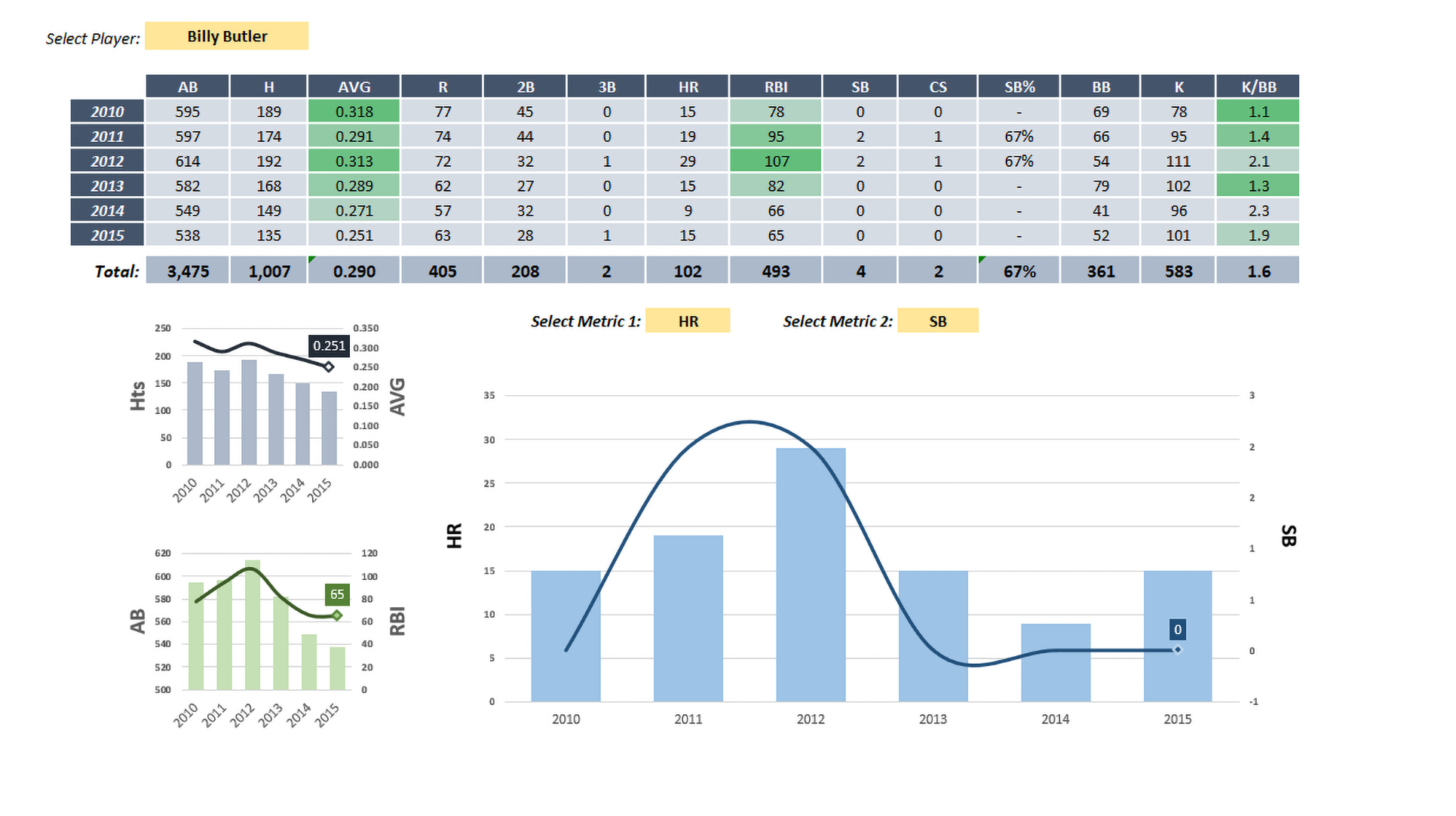
Some features that can be very interesting in a dynamic dashboards is when the visuals rely on and respond to changes in the underlying data. Charts will sometimes automatically resize, update, or change based on data filters. Conditional formatting can be used with colors, icons, or bars to highlight trends or anomalies. There is also the ability to customize dashboards to a organization or small business’s needs and tailored to specific goals or questions. They are often structured with user-friendly navigation and interactive components to make insights accessible to non-technical users.

In summary, a dynamic dashboard in Excel is defined by its ability to provide a live, customizable view of key metrics through real-time updates, interactive elements, and adaptive visuals. It’s a powerful tool for any professional seeking to make data-driven decisions efficiently.