Data Visualization – Heat Maps
Data Development - Rancho Cordova
Data Visualization: Heat Maps
Data visualization is more than just presenting numbers and graphs. It’s about crafting a narrative that informs, inspires, and drives action. A mismatched visualization can confuse or mislead your audience. The visual tools we choose play a critical role in telling that story effectively. There are some key elements of impactful data visualization like focusing on the importance of chart selection, understanding your audience, and leveraging heatmaps to reveal trends and relationships. In this case study we are going to explore heat maps.
Revealing Patterns and Insights Through Color
In this visualization, we leverage a heatmap to highlight trends and relationships. Heatmaps use color intensities to represent data values, making them an effective tool for quickly identifying patterns. They are particularly useful in:
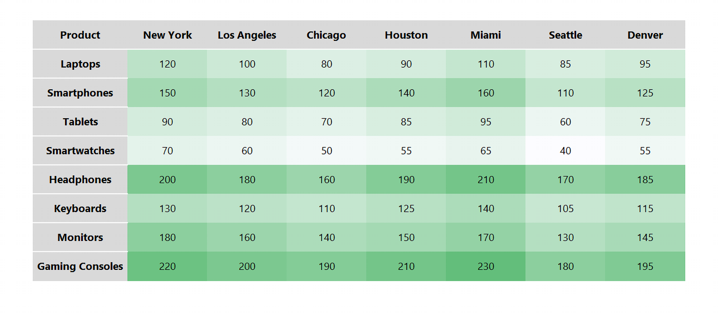
- Displaying large datasets.
- Revealing correlations or anomalies.
- Highlighting differences across categories or regions.
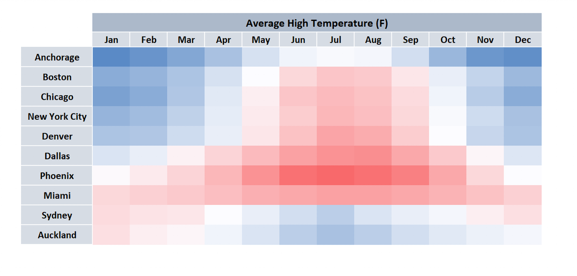
“For example, a weather heatmap could use darker shades to represent higher temperatures and lighter shades for lower temperatures, quickly illustrating regional weather disparities.”
Choosing Intuitive Color Scales
Color plays a significant role in how viewers interpret data. Selecting an intuitive color scale ensures that your visualization is both effective and aesthetically pleasing. Common approaches include:
- Red to Green: Ideal for showing good-to-bad outcomes, such as profit margins or customer satisfaction scores.
- Red to Blue: Suitable for representing contrasts like hot-to-cold temperatures or intensity levels.
- Avoid arbitrary color choices that lack inherent meaning, as they can confuse your audience.
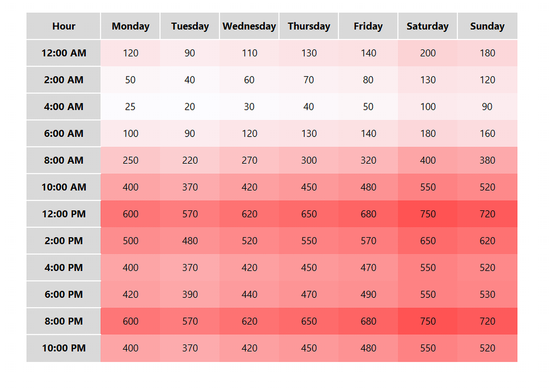
This visualization displays website traffic insights into the rhythm of user behavior. The peaks reveal moments of engagement, while the valleys show opportunities for optimization. Understanding this flow turns data into strategy.
Addressing Color Blindness: Inclusive Visualizations
Approximately 8% of men and 0.5% of women have color vision deficiency, making it essential to design with accessibility in mind. Use colorblind-friendly palettes, such as ColorBrewer or tools like Tableau’s built-in colorblind palette. Try to incorporate patterns or textures alongside colors to differentiate data points. Add labels or annotations to provide additional context and clarity. Making an effort to prioritize accessibility, you ensure that your visualizations are effective for all viewers, regardless of their ability to perceive color distinctions.
Data visualization is a powerful medium for storytelling, but its success hinges on thoughtful design. Choosing the right chart, understanding your audience, and applying intuitive and inclusive practices—such as using heatmaps with appropriate color scales—create visualizations that resonate. When executed effectively, your visualizations become more than a presentation tool; they become a bridge between data and decision-making.
At AnatoliaDev, we specialize in crafting impactful data visualizations that tell your story. Let us help you turn raw data into compelling insights that drive success.